The average therapist spends 1 to 2 hours a day writing documentation.
It’s the worst part of being a PT or OT.
By the end of the day, your brain is tired and it’s difficult to put into words the skilled treatment you just spent the entire day performing.
How I Saved 30 Minutes a Day on Documentation
When I finally learned how to document correctly, it saved me about 30 to 60 minutes a day.
I was tired of spending 30 to 60 minutes after the clinic doing my notes.
But that’s just what I saw my CI’s doing during my clinical rotations, so I thought it was normal.
Creating Systems and Key Phrases
Most of the wasted time in documenting (especially as a new grad) was in coming up with a sentence or two to describe my assessment of the patient’s performance.
1. I didn’t want to repeat the same boring assessment sentences.
2. I found myself lost for creative words or descriptions of my rationale for treatment.
3. I was tired at the end of a long day, so switching gears into ‘creative writing mode’ was difficult.
So I created a new system.
I identified key exercises and treatments that I commonly performed for my patients and wrote them down.
Then I wrote down multiple ways of describing my assessment of their performance.
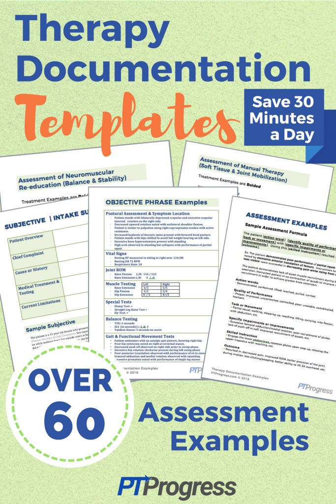
I ended up with over 60 assessment examples on a reference page.
I called it my documentation cheat sheet 🙂
Having a ‘documentation cheat sheet’ or a reference sheet of well-written assessment statements helped to spark my imagination, saving me 2 to 3 minutes per patient chart.
I see 10 to 12 people a day in the clinic, so saving 3 minutes per patient chart translates into 30 minutes saved each day.
Therapy Documentation Examples & Templates
Most documentation templates lack actual examples of defensible documentation that reflect the true skill in your treatment.
New therapy graduates often lack the experience in knowing how to write defensible documentation that is efficient and reflective of their treatment.
Enter Therapy Documentation Templates
These well-crafted documentation phrases save you time by providing you with inspiration on how to phrase the skill you provide to your patients.
You can copy and paste directly from the PDF, and modify the phrases to fit your documentation style and to reflect the skilled treatment you’ve provided.
This template provides you with real assessment phrases and paragraphs used in actual therapy documentation. Of course, you should always provide accurate documentation based on the skill you provided.
These templates simply give you the creative flow that you may be lacking at the end of a long day treating patients.
You can spend an extra 30 minutes a day typing similar assessments over and over. Or you can modify these templates to create a time saving system for documenting your skilled treatment.
What’s Included:
- Subjective Sample for Evaluations
- Objective Examples & Templates
- Sample Assessment Formula
- Over 60 Assessment Examples
- Assessments for Therapeutic Activity & Exercises
- Assessments for Neuromuscular Re-Education
- Assessment Examples for Gait Training
- Assessments of Manual Therapy
- Sample Evaluation Assessment Paragraphs
- Sample Plans and Response to Treatment Phrases
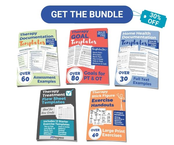
- and more (read the full outline of each product here)
These templates are a must-have for new grads or current therapists who want to save time so they can enjoy their life outside of the clinic.
Download the documentation templates and save time and mental energy so you can reclaim your evenings.